Designing Data Entry for Workers' Compensation Insurance
Designing and Evaluating a New Workers' Compensation System for a Property and Casualty Insurance Carrier
Introduction
A property and casualty insurance company is building a unified platform to streamline the quoting and servicing of all its 22 lines of business. Currently, each line operates on a separate system, but the new platform will support all 22 lines, starting with Workers’ Compensation. This case study highlights my work in designing and evaluating the data entry tasks for agents quoting new Workers' Compensation policies.
Methods
The design and evaluation process followed five key steps:
- User Research: Analyzed how agents and underwriters currently complete similar data entry tasks to identify pain points and best practices.
- Interface Design: Created mockups for the data entry tasks, focusing on user-friendly workflows and clarity.
- Heuristic Review: Conducted a heuristic evaluation of the mockups to spot any usability issues and ensure best practices in interaction design.
- Expert Feedback: Presented the task flow mockups to subject-matter experts for feedback, gathering formative insights.
- User Testing: Conducted formative user testing with agents and underwriters to assess user performance, satisfaction, and areas for improvement
Designs
The designs focused on the initial data entry steps for agents applying for Workers' Compensation coverage on behalf of a client. The core tasks include:
- Entering General Information: Capturing key details about the client’s business
- Adding Business Location: Including the physical location of the business.
- Adding Classes: Categorizing the business by type of work.
- Adding Individuals: Including employees and their roles.
- Adding Endorsements: Specifying additional coverages or exclusions.
Additionally, users need to edit information for:
- Classes and payroll details
- Individuals and their classifications
- Endorsements
Results of formative user testing
User testing revealed that agents were able to complete the data entry tasks successfully. Key results include:
- Task Completion Rate: 93%
- Average Time to Complete All Tasks: 9 minutes 32 seconds (Benchmark: 10 minutes)
- Average Ease Score: 4.7 out of 5
The system performed well overall, with a UX Lite score of 93.2/100 (Excellent), a look-and-feel rating of 4.7/5, and user feedback describing the system as "easy to use" and on par with other industry-standard systems.
However, 22 usability issues were identified that could affect efficiency, user satisfaction, and performance. These included:
- Missing class descriptions when adding/editing individuals
- Lack of instructions for minimum and maximum payroll amounts
- Unexpected behavior in monetary input fields
- Excessive scrolling required in class and endorsement selectors
- Inconvenient address input (better as a one-line autocomplete, like Google Maps)
- Slow endorsement download times compared to browser previews
- Slow save action for each item (e.g., classes)
- No warning when deleting a class
Sample of interface revisions
All the key interface issues were addressed in the redesign, but only two are described here:
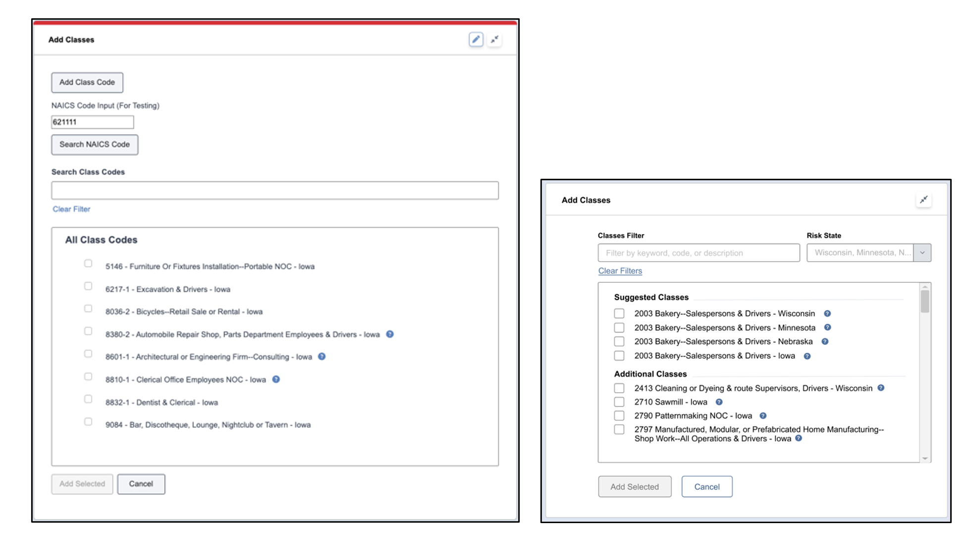
- Class Selector Labels: Users had difficulty selecting the appropriate class due to the absence of text labels in the selector. The updated design included clear text labels for each class.
- Before: no text labels
- After: Text labels added to each class option
- Class and Endorsement Selector Box Height: Users reported excessive scrolling due to the height of the selector box for classes and endorsements. The design was revised to reduce the box height by eliminating unnecessary buttons and adjusting the spacing between items.
- Before: Selector box height = 480px
- After: Reduced selector box height = 350px


Discussion
Overall, the user testing confirmed that the redesigned system enabled agents to perform data entry tasks with high accuracy, efficiency, and satisfaction. However, several issues need to be addressed to improve performance and user experience further. Moving forward, these refinements will be implemented, and the platform’s design will expand to other parts of the system, including reporting losses, error handling, quote viewing, and policy submission.