Data Entry for Quoting Workers' Compensation
An example of my work designing and evaluating the new system for Workers' Compensation at a property and casualty insurance carrier.
Introduction
A property and casualty insurance company was develping a new platform that will support the quoting and servicing of all lines of business. Currently the insurer has a separate system for each of the 22 lines of business, but in the future the platform will support all 22 lines of business. The first line of business on the platform will be Workers’ Compensation. This summary includes my work to design and evaluate the data entry tasks for quoting new polices.
Methods
Five steps were conducted to complete the work:
- Documented how users complete similar data entry tasks in related systems
- Drafted new interface mockups for completing the data entry tasks
- Conducted heuristic review on the interface mockups to identify weaknesses in interaction design
- Presented the task flow mockups to expert underwriters and agents and received formative input
- Conducted formative user testing on the implimented interfaces with agents and underwriters to (1) assess user performance in the system and (2) identify issues impacting user effectiveness, efficiency, or satisfaction
Designs
The designs can not be shared publicly online at this time.
Results of formative user testing
The user test found that users could perform the data entry tasks well the system. The task completion rate was 93%, the average time to complete all tasks was 09:32 (10:00 min benchmark), and the average task ease score was 4.7 of 5. The system measures were also strong with a UX Lite score of 93.2 of 100 (excellent), an average look and feel rating of 4.7 of 5, and user preference comments indicating the system was on par with other “good” and “easy to use” systems.
The user test also identified 22 issues impacting end user effectiveness, efficiency, or satisfaction including but not limited to:
- Class descriptions missing when adding/editing individuals
- No instruction about max and min payroll amounts
- Monetary input did not behave as user expected
- Class and endorsement selector box height requires scrolling
- Address input not as easy to use as a one-line autocomplete (e.g., google maps)
- Endorsement download is slower than a preview in browser
- Clicking save on every item is slow (e.g., classes)
- No warnings about the impact of deleting a class
Sample of interface revisions
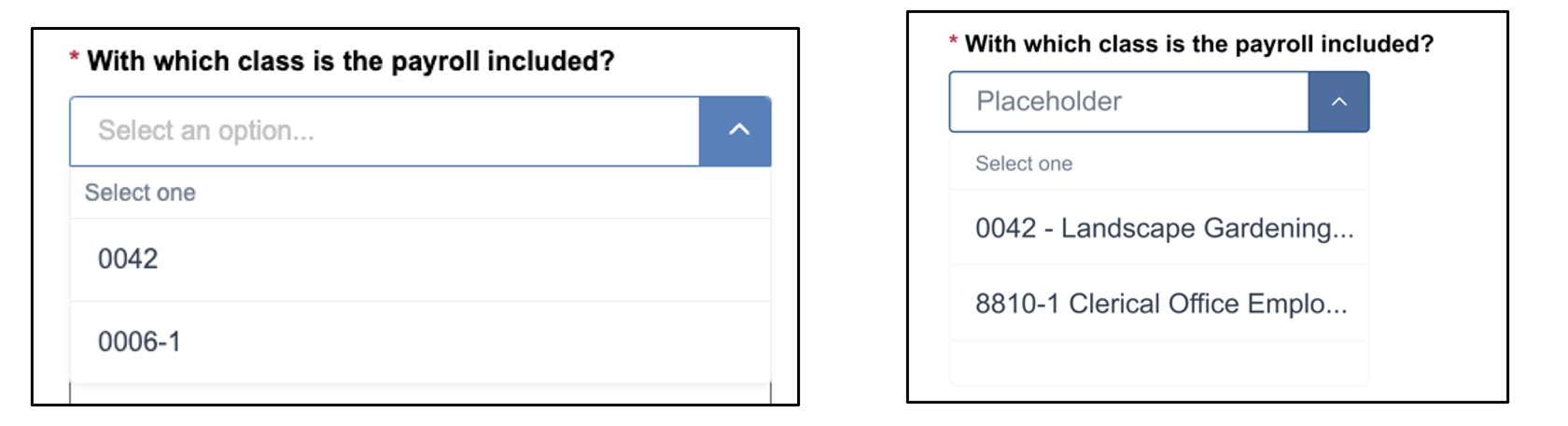
The fist example is while adding and editing individuals, users had trouble selecting a class because there were no text labels on the class. The revised interface should include text labels in the class selector.
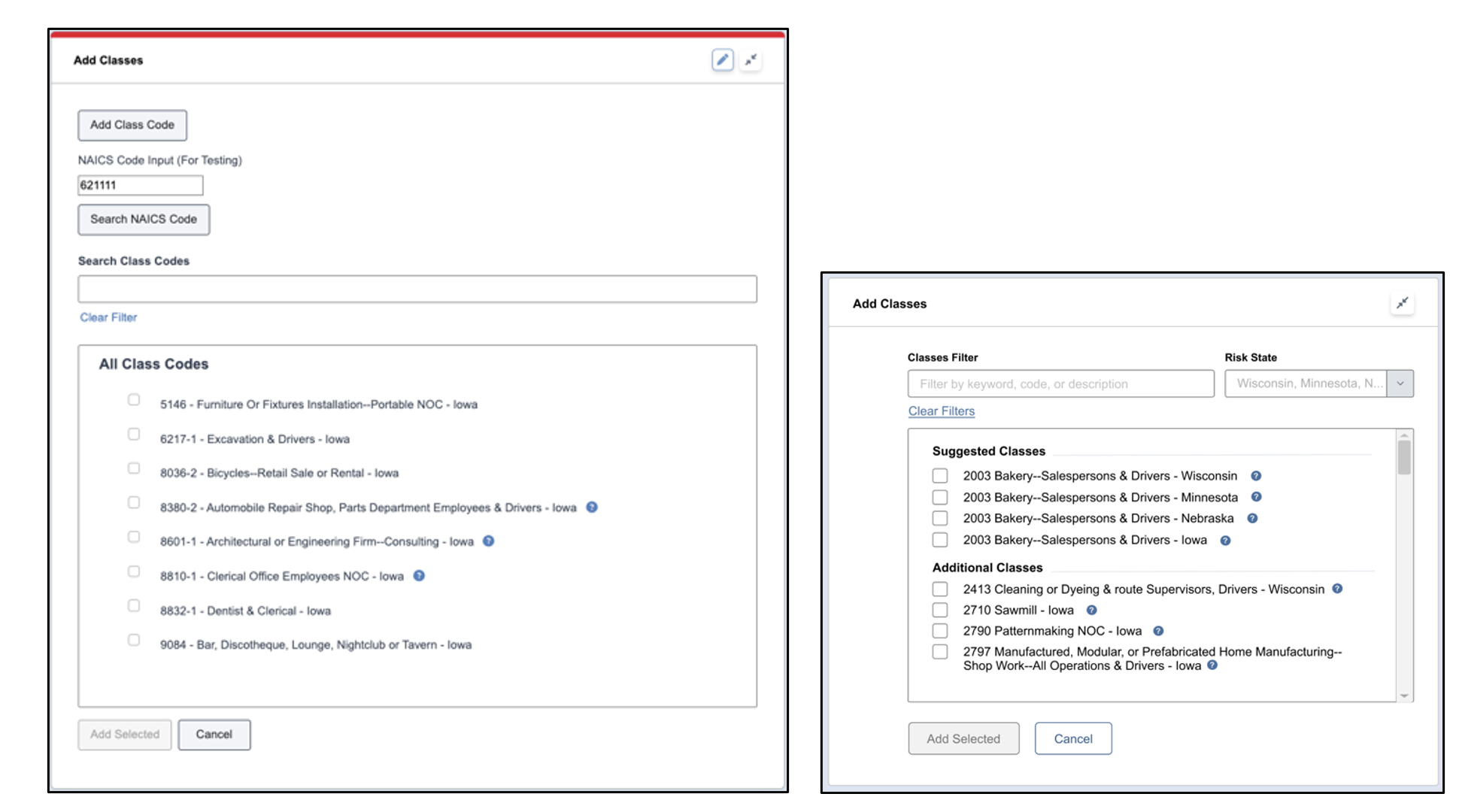
The second example is that while adding classes, users stated that the height of the selector box for classes and endorsements caused them to scroll more than they wanted. The revised interface should remove unnecessary buttons and decrease the spacing between items to decrease overall box height, which will decrease overall card height.
Discussion
The evaluation found that users could compete the initial data entry tasks effectively, efficiently, and with satisfaction. The evaluation also listed several issues that can be addressed to improve user performance in the system. Future work will revise the interfaces to improve user performance and satisfaction.